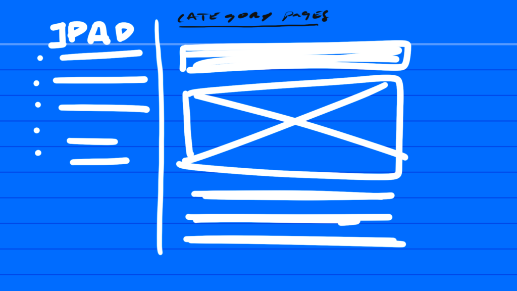
Just sketching this out real quick to capture an idea for the category pages, in particular for the iPad stuff on this site. There’s an ‘iPad’ category page but it just posts every single post with full content.
It’s just a
very
very
very
very
tall page right now.
Not super useful. If I want to continue adding smaller posts about things I’m using the iPad for then I need a little bit of a nav. This will likely stretch my template hacking to the limit.
But it starts with a sketch. Links on the left that will go to the full post.
